1

As the title says it all, I honestly do not understand what is going on with my drawings.

What I am saying is that I need help with someone who can explain to me what I am doing wrong with my physical artwork.

Here are two examples of my art:

Here is also an image that I have done digitally:

I am using Prismacolor Premier (24 Colored Pencils) while the sheet I was using is Bienfang Drawing Paper

2
  • 5
    What do you not like about them? What's the problem that you're trying to solve, and what specific advice do you need? :)
    – Erica
    Commented Apr 30, 2018 at 0:07
  • 5
    Please don't vandalize your own posts.
    – user6125
    Commented Dec 12, 2018 at 20:49

3 Answers 3

2

As Nothingismagick says make sure you're drawing what you see not what you mind says the object is. And make sure when you "see" something you're really looking at it. A simple example - a plate is round, that's what my mind tells me. But more often than not when you draw a plate you're drawing an ellipse, not a circle.

The eye you drew - the white is very seldom pure white. Think of the location and shape of the eye - the eye is under the brow, recessed so often the white part is shaded somewhat, and since it's a sphere as you approach the corners of the eye they are going deeper below that brow and getting slightly, ever so slightly darker. And what are the proportions of pupil to iris to white area showing in respect to each other. You start to understand that by observing, really looking at your subject.

Draw loosely at the start not committing to hard lines - it will look sloppy but you can always erase what you don't want. I'd use (and I do) simple lead pencils to sketch out drawings. Whether they are for paintings or just a sketch on it's own.

Draw simple items to start - human figures or even parts of the body are by no means a simple drawing exercise. Simple still lifes are good starts - to this day I will find myself drawing an apple just to contemplate the shape and how to define the form with shading.

When you want to start drawing human figures/parts search online for the masters and how they sketched items - Da Vinci, Michelangelo it's amazing how they represented figures with simple lines, very few lines in some cases. Study what they do to represent an eye. And always notice how form comes from shading - variations of a hue if you're using color.

Also do you have any formal training? There are tons of tutorials online to help beginners and advanced folks - take advantage of them. And if you draw something and don't like it try to figure out exactly why you don't like it - then throw it away and try again. I can literally sketch the same subject 50 times before I approach what I want.

I've been drawing a long time and hopefully my suggestions help. Good luck and keep trying it will come.

0
1

Well, as my most favorite drawing instructor told me, you have to forget the name of the thing you are seeing when you draw it. That means that you look at shapes - not pupils and eyelids. The means that you look at the colors of the highlights and the shadows - not the name of the prismacolor pencil.

You seem to have a great imagination, but you should spend more time looking, and learning to draw what you see. This post that I wrote goes into more depth and detail about drawing realistically.

0

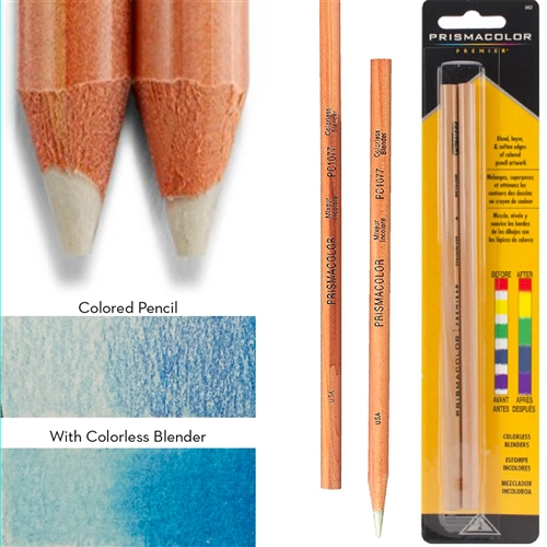
The way to make Prismacolor pencils look vibrant is to entirely saturate the area you are trying to color in. In your drawing, you color large swaths of paper quickly, pressing lightly with the pencil. If you want this medium to look good, you will have to press harder with the pencils to fully saturate the area you are coloring. Additionally, you may want to experiment a bit more with blending. You can achieve this by coloring lightly with Prismacolors and overlapping different colors where you want the blending to happen; then, gradually build up the saturation until the transition looks right. (You can also use a clear blending pencil for this).

Here's an image showing the effect of making a gradient with one pencil vs making the same gradient but using a blender. You can use this effect for gradients, color transitions, and just making solid colors look smooth and velvety on the page.

enter image description here

Additionally, based on the art samples you put on your post, I suggest making much smaller drawings for practice, as you will find Prismacolor is more labor intensive when you are fully saturating the areas you are coloring. I suggest trying an area about the size of a photograph for your next drawing.

You must log in to answer this question.