4

Seeing colors as black and white values is an essential skill in classical paintings. Yet art manuals and instructors usually only recommend to squint and, at most, to buy a grey scale.

Lame!

This is in the form of a Q&A, where art meets craft, though I would appreciate any other contributions.

So, how do you easily see grey values in color? Or train yourself to?

3
  • Related, but about finding the hue/saturation rather than lightness
    – user24
    Commented May 22, 2016 at 23:42
  • I added a line in your question, to maybe encourage additional answers. If you don't like it, feel free to remove it.
    – user24
    Commented May 26, 2016 at 12:24
  • In classical painting the underpainting does have color as well as tone. Typically the paints in the underpainting are desaturated, but still with warm and cool qualities. Depending on the desired effect the underpainting can be done in fully saturated colors as well.
    – rebusB
    Commented Sep 27, 2017 at 22:10

5 Answers 5

3

Here are some of my solutions

  • Red filter

Anything seen though red is unsaturated; this is the easiest way particularly to see the scene to paint as a whole. Some DIY glasses have red lenses, some photo filters and gels too, cellophane plastic, plexiglass, tinted glass, or red light bulbs to light the scene.

The cheapest and easiest way by far is to buy a sheet of red-colored acetate plastic. You can just hold it to your face or fashion a simple visor with it.

  • Grey scale

Typical photo grey scales go from white to black, with indentures on top. If you need gradations you don’t need extremes, forget highlights and darkest shadows, if you use a typical grey scale you will end up with 2-3 gradations dominant in the painting. Moreover, the gradations are machine made and may not reflect the reality of the values you need.

The best way is to paint a grey-scale yourself with at lest 7 gradations that are needed. You can also paint several of them varying dark tones, light tones, and colors scales.

  • Wheel grey scale.

Typical grey scales are rectangular with indentation on top. That doesn’t really work because you see the values of all of the other colors above it. Visually, the values of colors change when seen next to each others. To get an accurate value of a specific part, that color must be seen independently from the other colors.

The cheapest and easiest way is to use an old camembert wheel box for the disk. You need a hole in the center, only big enough to see through. Divide the wheel into parts 8 or 12 quadrants and paint the scale on it. Also, you can paint the back of the disk mat black so you can see and judge the color from the other side without distractions or white reflections. You can glue the disk to a thin handle to easily vary the distance from you eyes.
1

I would suggest that thinking purely in terms of grey scale may be placing an artificial restriction on yourself.

It sounds like what you are really interested in is to train your ability to make the connection between shade and three dimensional form with reference to depth and lighting.

I would suggest that the best way to do this is to do a lot of monochrome drawing exercises, particularly of arbitrary shapes (such as randomly draped cloth) where you don't have any prior knowledge to inform you of what the form 'should' be. Similarly doing similar exercises under very directional or monochrome lighting may also help. Here it can help to force yourself to tackle subjects which seem impossible to draw such as piles of rice or pasta, bundles or rags, screwed up paper etc etc.

It may also be useful to do as bit of basic sculpture in a plastic medium such as clay just to help to reinforce the link in your brain between the form that you see and the form that you are reproducing.

Ultimately life painting, drawing or sculpture is about finding a method of translating what you see onto a piece of paper, canvas or whatever and this applies just as much to more abstract and expressive approaches as traditional representational painting and this translation process is what defines your individuality as an artist.

1

Not really that lame at all. It is something you want to be able to do on your own, and if squinting helps than you are one step closer to that than if you are using some other tool.

Color has hue, saturation, and value (or tone.) What you are doing in your minds eye is ignoring the first two to extract the third. But there is also relative color, and the tone you get from one color will appear very different depending on the colors around it.

The grey scale is a just a tool that has done the first step for you, so you can compare side by side to get your value name, usually in 10% steps of the percentage of darkness where 0% is pure light/white and 100% is pure darkness/black.

But really, the faster you can ween yourself off of using devices to interpret tone values the sooner you can do it purely in your minds eye and the better off you will be. It is the tone you choose to apply along with its neighbors in the artwork that matters, not its name.

1
+100

Notwithstanding that sometimes the proper way to do something can be lame, here are a couple of alternatives:

  • There are, to start off somewhat obstinately, of course multiple types of greyscales, and the one might be easier to use than another. The kind with perforations or excisions, for example, allow you to isolate the colour you're comparing to.
    The problem, after all, is that our perception of colour is very relative: it is influenced by what we expect to see, by adjacent colours, by colour temperature. That's also why, when comparing colours to a greyscale, one might still need to squint, to lose the intensity of the colours.
    These greyscales you can either make yourself, by painting a grey scale on a piece of cardboard, and perforating every value with a hole punch. You can use the exact same colours you are going to use in your painting, which makes it even more convenient. You can add pure colours adjacent to the greys to see what value they relate to.

  • Another option, that I have made use of when using photographic references, was taking a transparent sheet of plastic, painting on it (near one of the edges) a provisional greyscale from pure black to pure white. An advantage is that you can take colour from your own palette, paint it directly on the sheet, and easily compare it to the reference colour.

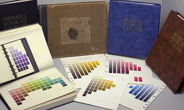
  • Then there is the Munsell Book of Colour, about which I read here: it comes in two different price categories, but both books seem to be worth the investment. The cheaper 'New Munsell Student Color Set' explains the Munsell colour system (based on the three pillars of hue, value, and chroma), and offers a lot of information on colours and colour theories in general. Both books contain colour chips (the 'Big Book' is merely a collection of nearly 1600 colour chips) that can be ordered by the user, and, meanwhile, acquaint him or her with getting a closer understanding of colours.
    According to user gunzorro on the linked forum:

    For me the experience is beyond the "Munsell System" to a rewiring of my brain for larger view of the color universe. I'm getting a tactile experience of being able to pull chips and arrange in strings or sequences much more quickly than with paint tests. Color matching against common objects and my past paint mix samples is greatly enhancing my color identifying skills, which improves my imaginative color skills. I'm now better able to visualize color relationships in the vast color space, and use the chips to confirm.

    This will surely be beneficial for a greater understanding of the value of colours alone!
    In the same thread you can read about what some users did to increase their conception of grey values. Apparently, the books have assignments to teach the user about their mixing, temperature and relation to other colours.

    Munsell Book of Color (image from Wikipedia)


  • The easiest, and, probably most fun way to teach yourself to 'see in colour values', is to restrict yourself to painting 'grisailles'*: paintings executed in monochrome, usually a grey (but other relatively neutral colours are also used, because, while you mention greys in particular, I guess you are referring to colour value in general).

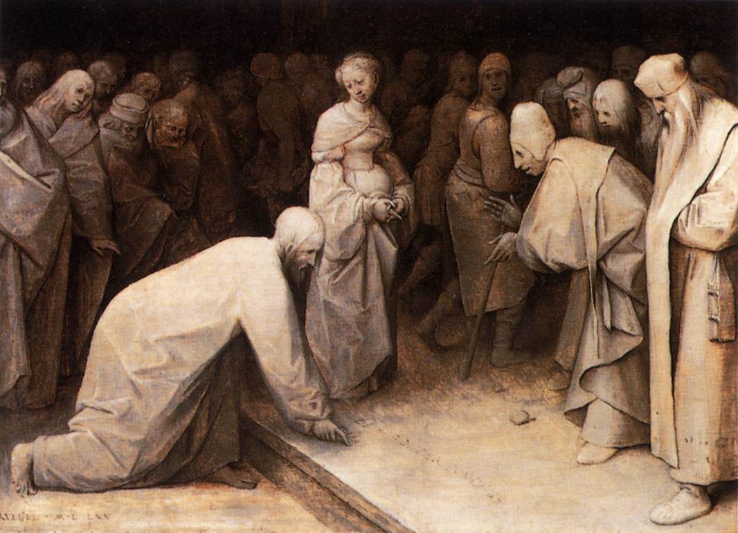
    Its most common use is as an underpainting: the preparatory stage of a painting, usually followed by glazing, that allowed the artists to get a clear idea of mass, volume, light, and shadow within the composition, and to more easily make final changes (pentimenti) to the design. This is usually (and more appropriately) referred to as dead-colouring ('doodverven'), as it lacked colour. This was often done in a warm brownish monochrome made from ochres, which dry quickly, allowing for easier drawing and quicker corrections.

    Christ and the Woman Taken in Adultery - Pieter Bruegel the Elder - 1565

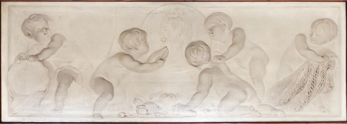
    The technique was sometimes used in its own right as a painted imitation of sculptural groups or reliefs in stone. The Dutch artist Jacob de Wit was well-known for these 'witjes':

    Allegory of water with Neptune - Jacob de Wit - 18th century

    Working en grisaille is still done in some of the more classically oriented art academies as part of the curriculum, exactly for the purpose to get a clear conception of value in colour as a basis for a better understanding of the imitation of mass

  • Alternatively, but somewhat similar, is limiting your palette to three or five shades, either in the same, or - to make it a little harder - in different colours. This will force you to see your reference as consisting of a limited amount of relatively large ranges of colour value. After having blocked in the large parts, you can always decide to continue by blending more values.


✝ But be sure to check here for the other side of this coin.
* This term has referred to the examples drawn by artists for printmakers to create the plate, as well, and these were normally executed in grey scale.

0

While I'm not a painter, I often need to see things in monochrome to check for contrast, as I consider the colorblind when working. (Those who are red/green colorblind comprise 10% of the population (!); there are far fewer blue/yellow sufferers.)

In order to accomplish this, I take a photo of whatever it is I'm working on (or what I'm using as inspiration) and then desaturate it using whatever graphics software I have at hand (Photoshop! Gimp, etc). There's also an option to convert the image to monochrome; I try that, too.

Perhaps this tip will help you with your painting. Food luck!

You must log in to answer this question.

Not the answer you're looking for? Browse other questions tagged .